What the polls are saying!

What the polls are saying!

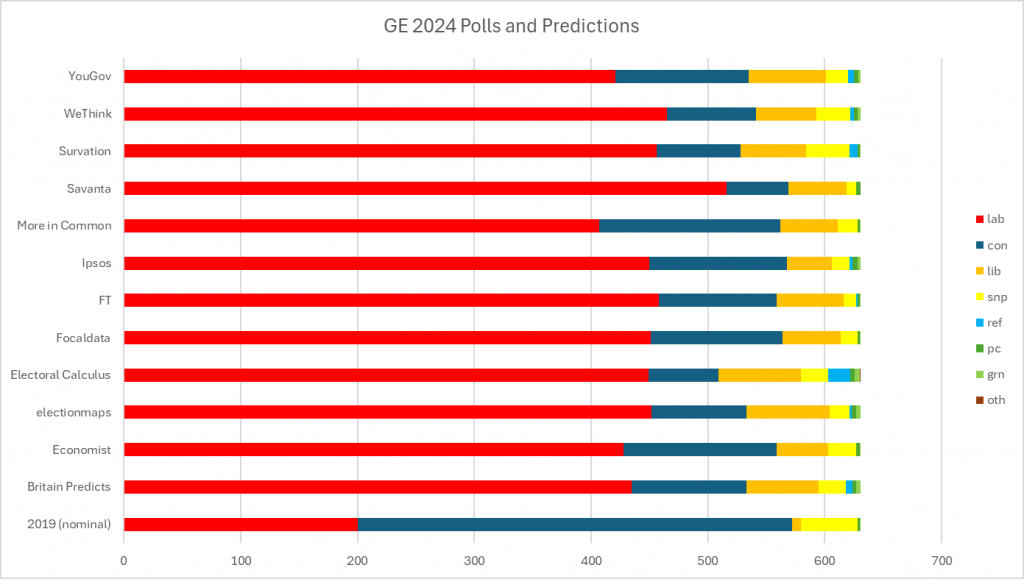
Some clever person or several has made a page categorising and displaying the results of the various MRPs that have been undertaken. They have posted their results here. I made a chart allowing a comparison of the various forecasts, it makes astonishing reading. The original post allows each British seat to be examined.

Everyone thinks there will be a large Labour Majority, only Electoral Calculus thinks Corbyn will win in Islington North and they i.e. electoral calculus have some other interesting outlier results, inc. that the Libdems beating the Tories. The Reform predictions vary from 19 seats to none and the Greens from four to none.

Labour’s majority is forecast to vary between 382 seats to 214 seats.

 …

Polling Leads over time

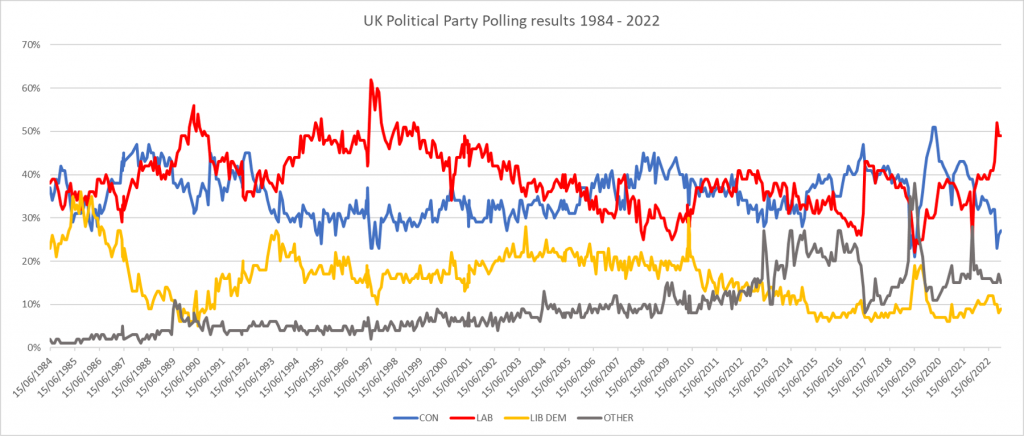
Labour’s current lead in the polls is suggesting that there will be a Labour landslide at the next election but I made a chart of the polling history of Westminster election intentions since 1984. This is an attempt to put this in historical context.

The history of UK Polling data for Westminster elections; from 1984

As of today Labour would seem at elections to underperform its polling results. Some say this is down to low turnout.

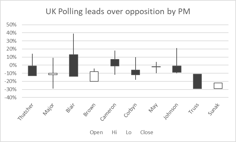
I was interested answering two questions, the first is that no Party with such a large polling lead has ever lost the following election. This would seem to be false. Johnson threw away a huge lead and while it took Blair over two parliaments, his lead fell from a max of 39% to -14%. Only Blair and Johnson have had leads over 20%. Only Major, Brown and Sunak have increased their party’s polling lead. The other question is about whether the allegation that Corbyn was substantially less popular than Labour deserved.

I have made an Open-Hi-Lo-Close chart of the PM’s leads and added Corbyn. To truly understand if Corbyn was worse than others, I’d have to show the other Labour leaders.

To remind us how to read these charts, if the entry is black, then the lead fell, the opening value is the top of the box, and the close value the bottom. If the box is white, then the value increased and the open value is the bottom of the box, and the final lead the top of the box. The lines above and below the box illustrate the high and low values, which in the case of Truss and Sunak are the same as the open/close values. Blair’s high number above the opening value was achieved on day one, and illustrates the difference between the poll and the general election vote. (I wish I could add red and blue colours to the chart, but it’s a restriction on the tool.) I’d say Corbyn while not good, was not appalling at least that’s what the number’s say, although he had become an issue by 2019.

It seems that Redfield and Wilton have also produced a chart, but only for the last 18 months. These numbers come from my interpretation of politico.eu’s poll tracker, using the Guardian ICM numbers from 1984 to 2016. My spreadsheet is here. …

Is he up to it?

Is he up to it?

Reading Polls takes some care which is why I suggest that one reviews polls that illustrate the range of results rather those that at the moment maximise Labour’s support.

Whether the polls suggest Keir is better thought of than Boris seems to depend on the question asked. Straight forward net approvals, Keir’s score is better than Boris although the gap seems to be closing, over the last few weeks, Boris score has improved, Keir’s has fallen. When asked who’d make the best PM Boris often wins although not at yougov, you can inspect their numbers here, or or in chart form on  Starmer vs Johnson, approval ratings, on this blog from last week. Opros, who I have not heard of,  has Boris ahead and also discusses the different questions asked.

I am concerned that neither he nor we are doing well enough, and I am not alone nor isolated with those his supporters might consider the usual culprits and those who expressed disappointment or opposition from day 1, sadly making what was a moment, into a tradition.  Unlike 172 members of the PLP in 2016, I am not calling for a no-confidence in either Starmer or Rayner within a year of their election since that would be an act of contempt for the tens of thousand that voted for them; what I am asking is that those that did, honestly answer the question, “is he up to it?”

He has been good in the Commons, but it only counts if the press report it; he’s been poor on PPE, poor & late on lockdown,  poor on last summer’s exams, poor on COVID-19 safety in schools, the choice of competence and not corruption is questionable, we are poor, virtually silent, on sick pay and redundancy pay, have abstained on human rights law diminutions by not properly opposing the spycops law,  nor supporting the extension of the eviction  ban and his collusion on Brexit, both not arguing to extend transition and agreeing the, what is now obviously seen even in such a short time, terrible future relationship and withdrawal agreements makes dealing with the fallout from Brexit more than tricky and we again collude with the laws that may yet reopen the lethal armed violence in Northern Ireland. He is also backing Boris on Scottish independence, a brave move, given how we got to where we are in Scotland. Are you sure he’s up to it? I am not suggesting that given the choice you were wrong to vote for him, I thought about it, but is he meeting your expectations, if not, perhaps you should tell him. …

Where’d the votes go?

Where’d the votes go?

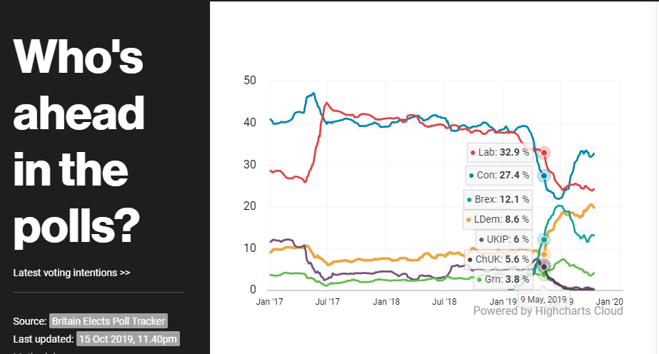
Within the Labour Party, there is a debate about the position to be taken with respect to Brexit due to electoral considerations.

Here is a chart showing the polling results; what interests me is the change of fortune on the 9th May. On the 1st of May, Labour’s NEC refused to change it’s policy of an election before a referendum on remain. At the time, Labour were first in the Polls, two months later, we lost half our MEPs and slipped to 2nd losing between 10 – 15% of our predicted vote share.


How accurate are the polls?

Here are three links which talk about the methodologies used by the polling companies, the “House Effects” even tries to quantify the statistical bias in these methods. Fact is some polls favour Labour, some favour the Tories, but non have recently said that Labour is ahead. Sadly my favourite seat predictor at flavible is currently offline, but provided we stay above 25% and the Brexig Party & LibDems overperform, the most liklely result is a Labour minority govenment.

Others have argued that the methodology biases put the polling houses into two classes, neither are owned by the Tories but the bias is clear. Lets hope that those who say that we can still out campaign the Tories are right, but they won’t be as shit as May and we won’t take them by surprise on social media.

We need to remember how most polls got it wrong in 2017 and ‘House Effects’ examines that.

It’s going to be hard.

ooOOOoo

  1. ‘House effects’ and how to read the polling tea leaves…, at Southampton Politics
  2. Latest voting intention and the difference between the polls, at UK Polling Report
  3. A Journalist’s Guide To Opinion Polls at the British Polling Council.

  …