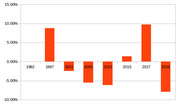
In my article, Lies, damn lies and …, I produced a chart showing Labour’s voter share since 1992, I have now produced one that shows the change in voter share, (and now one that shows the change in number of votes, they tell an interesting story.
I decided to do one on the changes in Labour’s voters under New Labour.
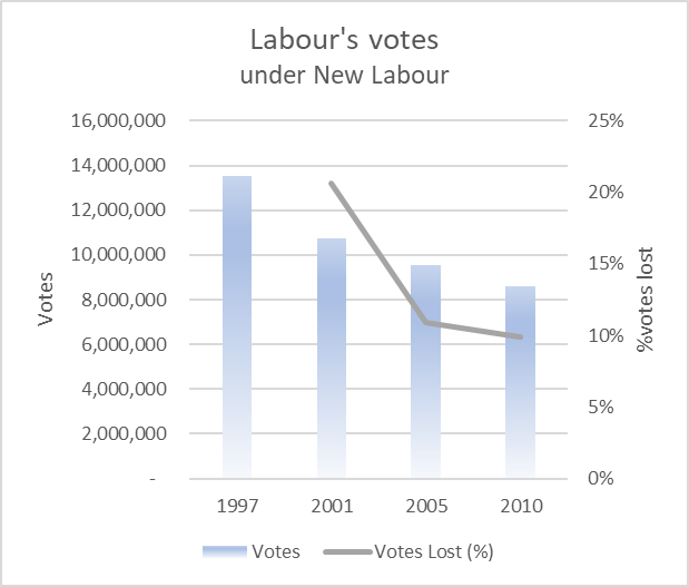
This shows Labour’s vote and the %change from the previous election.
Deltas
If you map vote share over a longer period it is a mostly down trend for Labour. 2017 was an outlier in many ways.
Although look at Scotland in the same time period and London. Marked differences in the steepness of the curve. Overall trends are similar though. There is certainly a long term problem that a fancy leader in Armani or some re-branding with new logo’s are not going to fix.
I have added the 2nd chart, Labour Votes under New Labour and % change.