In my last piece of work, I needed to create some box charts using excel 2007. I have always planned to document this for the world, (or my little readership at least) but when my colleague Jim Barrett showed me the button in the Sparklines menu that does them in Office 2010, I decided to get this done in a hurry. As I said in my last blog article on Excell, I am losing track off Open Office, but this technique also works in Open Office 3.2.1. Most of this article is about making it work in Excel, but I have described how to set error bars in Open Office.
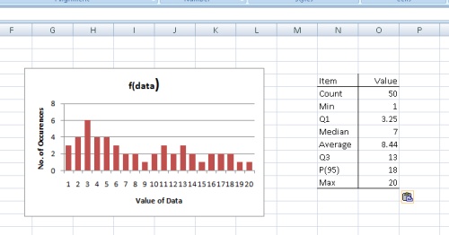
I have amended my trusty example file to include the sample data and some intermediate steps and to generate the pictures for this article. The example is on the tab named ‘Box Charts’. I also uploaded an example Open Office spreadsheet. I have generated the sample data set and created a frequency distribution and associated graph. The final piece of pre-preparation is to create an item/values table to capture the important facts about the distribution.
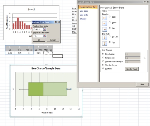
I use a ‘stacked bar chart’ chart type with error bars and have created a table that has as its first three elements the first quartile value, the median value minus the first quartile, and the third quartile value minus the median. Column 4 is the -ive error bar and is first quartile minus the minimum value , and the final column is the +ive error bar which is the maximum value minus the third quartile. This transformation is required because we are using stacked bar charts, therefore each charted element needs to be the difference between the quartiles. The table illustrated below describes the calaculation as well as performs it. Mu represents the Median.

I then created a stacked horizontal bar chart using the wizard, having selected the first three columns only.

I have used the Design Chart Styles Widget to change the design to make all three series green and to ensure they have a border; we will need a border to illustrate the median. Now it is necessary to insert the error bars and make the bar chart element representing zero to the first quartile invisible. If you do it in this order, it’s probably marginally easier. The insert error bars dialog is on the Chart Tools – Layout menu.
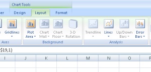
I insert the error bars one at a time. In order to insert the -ive error bar, select series 1, i.e. the graph bar representing column 1, and use the “Error Bar”, “More Error Bars” options. Select “Custom Values” and assign the value of ‘Min to Q1’, Column 4 in my example to the -ive entry box. The fourth quartile is represented by assigning a +ive error bar to Series 3, i.e column 3 using the Max to Q3 value, which is Column 5 in the example. It is the assignment of the +ive error bars that is illustrated immediatly below. Since we are inserting the error bars one at a time and assiging them to different series in the chart, the radio button widget must be set to ‘plus’, and the ‘Cap’ option set.
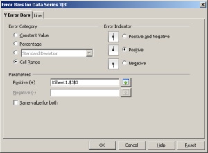
For Open Office V3, when you selet the data series, it offers you the context menu option of Insert Y error bars. Invoke this dialogue and set the ‘Error Category’ radio button to ‘Cell Range’ and then set the appropriate cell range values to Column 4 for the -ive bar, assigned to Series 1 and Column 5, for the +ive bar assigned to Series 3.
I then use Format Series to set Series 1’s display options to No Fill & No Line. The final graph appears below.
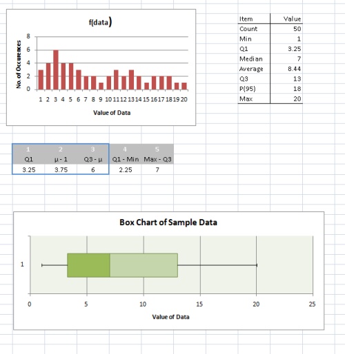
The box chart now shows the 1st and 4th quartiles as horizontal lines, the second and third quartiles as boxes, and the median as a vertical line seperating the two boxes.