Goodness, here’s the Bank’s page on Quantitative Easing. The last tranche is £645bn. It’s a shit load of money and I find this an important quote,
Suppose we buy £1 million of government bonds from a pension fund. In place of the bonds, the pension fund now has £1 million in money. Rather than hold on to this money, it might invest it in financial assets, such as shares, that give it a higher return. And when demand for financial assets is high, with more people wanting to buy them, the value of these assets increases. This makes businesses and households holding shares wealthier – making them more likely to spend more, boosting economic activity.
The italics and underlining are mine. This is not a plan, it’s a dream. More likely!
If this is designed to boost aggregate demand, then it does so through the lending market and is mitigated by peoples expectations and animal spirits. Poor people spend more of what comes in and are also more debt adverse or will be excluded from borrowing [more] and there’s more of them. If it’s defending aggregate demand that’s needed then we should be pumping this money out through the benefit system nc. the in-work benefit payments; SSP and Redundancy should be state paid/underwritten benefits, not paid by employers nor underwritten by loans. If it’s about protecting the poor inc. the in work poor and vulnerable, then doubly so.
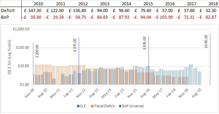
See below/overleaf for a chart showing its size compared with both the fiscal deficit and balance of trade deficit.
A shit load of money!
Here’s a chart showing the fiscal deficit vs. the tranches of QE.

- The units of measurement are in £bn.
- Both the fiscal deficit and balance of payments have been expressed as a modulus
- The vertical scale is logarithmic (the chart is unreadable otherwise), the horizontal scale is monthly; I have derived the monthly numbers from the ONS quarterly numbers. I excluded the Q2 2011 figures because they were under £1bn and made the chart look very strange.
- The source are BoE for the QE tranches, and ONS for the other two series.
The Guardian posted the following article in 2012, “Britain’s richest 5% gained most from quantitative easing – Bank of England“., which I found when looking to explain the 2012 tranche.
ooOOOoo
Hugely amused to find the picture with the Chinese Flag against the west wall of the Bank; seemingly appropriate. The picture is from flickr, owned by the Bank CC 2014 BY-ND.