I used an Excell 2007 Pie of Pie chart the other day for the first time. It may be that these are not very sound statistically but they can be powerful graphics. It wasn’t exactly intuitive at the first glance. Here’s how I did it.
I created a data table which occupies B2:C13. This contains all the name value pairs that exist, and I have created a secondary/summary table at E2:I5. I shall plot the sum of the values in my base data table. The diagram immediately below shows how the summary table is constructed. It uses the=SUMIF function and named ranges. B2:B13 is named “names”, and C2:C13 is named “values”. SUMIF takes three arguments, the test range, the test value and the range to summed. In this case, I have used a relative test value, held in row 2. The Summary table holds the data to be plotted in the Pie Chart.I used the Insert >> Pie Chart to create the Pie Chart at the bottom of the picture below, and used Insert/Format Data Labels to label the Pie Chart. The reason I have gone through this is that a Pie Chart only represents one series of data and in order to make the Pie of Pie charts work, one has to build a new table; a Pie of Pie charts emphasis a sub set of the data plotted, but not by category.
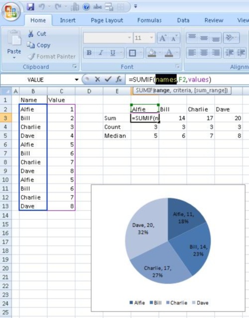
Figure 1: A standard Pie Chart.
Since Dave is my higest scoring category, I decide to explode Dave using the secondary pie chart in the Pie of Pie Chart. As stated I need a new table, which has each entry for Dave as a separate line in the table. This is shown in Figures 2 & 3 below.
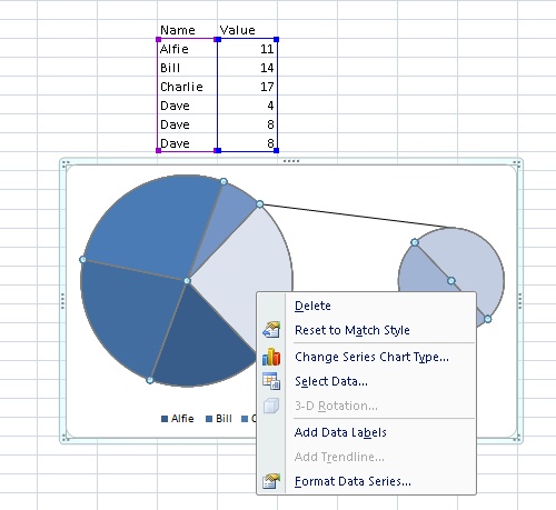
Figure 2: Default Pie of Pie Chart.
The table at the top of Figure 2 is the re-arrangement of the data, which you can compare with the original data set in Figure 1. The Graph shows you what “Insert >> Chart >> Pie of Pie” creates as a default. Now we need to set the labels, change the membership of the smaller pie chart and change the size of the smaller pie chart. You need to use “Format Data Series” to do this, by selecting the included category in the larger pie chart and using the right click pull down menu. This opens the Format Data Series menu.
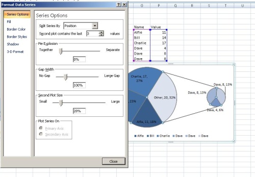
Figure 3: Format Data Series.
The Format Data Series menu allows you to manipulate the number of members of the second set, and the size of the second plot. The spreadsheet in which I did this is available for download here….
Having written and published this article, I was thinking about it one the way home and came to the conclusion, that if one had a data series with a few very large members, and a lot of similar sized smaller members, then Pie-of-a-Pie could be used to illustrate the distribution because it offers two scales. You could collect the smaller members into the second pie. This would not involve creating a new table, but you would have to sort your data table so that the candidate members of the smaller chart are contiguous. I have created an example, see Figure 4 below, and this is now in a second tab in the demo spreadsheet DL 17-12-2010

Figure 4: Two Charts showing labeled large and small values.
I have tried to import the spreadsheet into Open Office, but OO doesn’t support Pie of Pie.
I started to write the second of the series that I had planned and found the links to the demo spreadsheet broken. I have now fixed them.