I was having another look at the macro-economics of the country. I was looking at growth (δY) and income distribution ( 1 -L(Y) ). I have built some growth charts but have run out time for the moment on income distribution, partly because the stats aren’t saying what I’d hoped. Perhaps ONS don’t measure this to the level of granularity that we need; they use 20% and 10% tranches. I might come back to this, otherwise here are my notes.
Sources
- https://www.theguardian.com/news/datablog/2009/nov/25/gdp-uk-1948-growth-economy, sadly dated to 2012 but easy to cut and paste into a spreadsheet.
- https://www.ons.gov.uk/economy/grossdomesticproductgdp
- https://tradingeconomics.com/united-kingdom/gdp-growth
- https://www.equalitytrust.org.uk/how-has-inequality-changed
- https://www.equalitytrust.org.uk/scale-economic-inequality-uk
- The Gini coefficient by wikipedia. a means of describing income inequality, (or any frequency distribution).
- On wikipedia, an image of a chart showing Gini since WWII, these people have a number going back to 1955, but I can’t find the data
- https://fullfact.org/economy/fifty-years-income-inequality/
- Living standards, poverty and inequality in the UK: 2016 by IFS
- GINI index (World Bank estimate), claim to have the data, but looks to be quite recent only.
While looking to see if there was an agreed symbol for income inequality I came across this, Measuring Resource Inequality: The Gini Coefficient by Catalano, Leise & Pfaff which describes the maths used to calculate the GC.
An Analysis

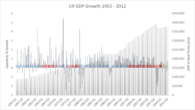
This chart shows the real value of the UK GDP since 1955 by quarter, the line series shows the value of growth (±), the red line shows the date of joining the EU and the coloured blocks show the party in government. The source is the Guardian article mentioned above which uses ONS data.
Here, UK post war real GDP, is the spreadsheet (.xlsx) for you to play with.
I returned to this and found these sources on poverty and income distribution.
- Labour’s record on poverty and inequality by the IFS
- An assessment of Labour’s record on income inequality and poverty, by Joyce and Sibieta on New Labour’s anti-poverty programmes. Child Poverty down but income inequality up. Oops
The two means of describing income inequality are the Gini coefficient and the ratio between the top 20% and bottom 20%. The latter will not reflect well the massive incomes earned by the top 5% and top 1% and figures based on HMRC data will under state the true earnings of the self employed.
I added the references to New Labour’s anti-poverty programmes today.