I was looking at some economics of the EU and decided to plot income and unemployment, I was hoping to see how much geography made a difference. Here are my notes …
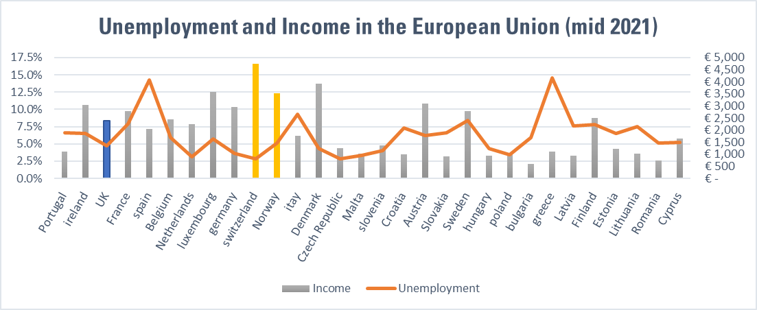
I have used various sources, statista and trading economics for the unemployment and wikipedia for the income. The income is monthly, the blue and yellow colouring are obvious; they are non-members. This chart is ordered west to east.
I added the gini co-efficient,
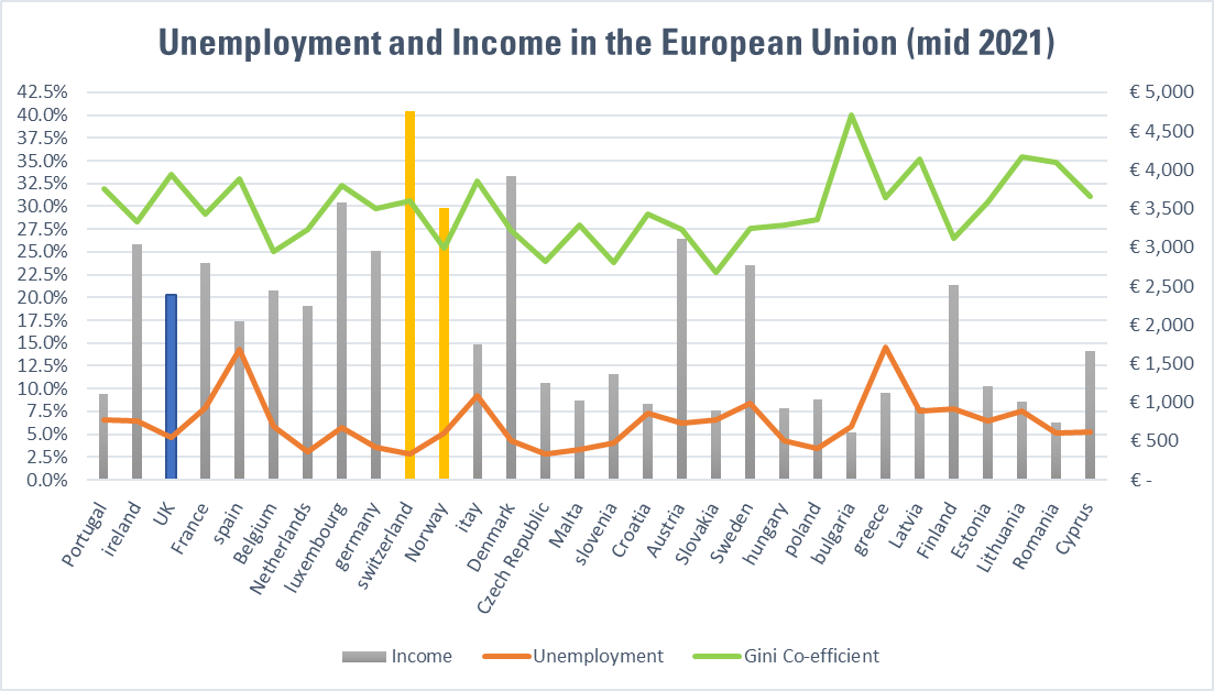
This following chart is ordered by Income,

The following chart is ordered by the Gini coefficient,
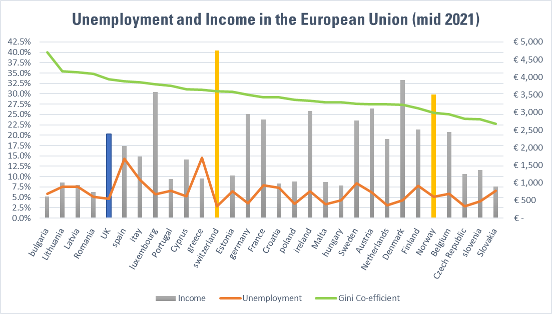
with a max of Bulgaria, at 40% and Slovakia at 23% and the UK at 34%.
I have uploaded the spreadsheet with the data.
It might be fun to do some hypothesis testing but I would have to dig out my stats text books again.