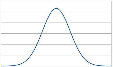
How to make a normal curve from a spreadsheet; I had some help but this is how to do it in Libre Office. I can’t find the pages that helped me now, but others have written about this.
- Create a scale in a column, in the example, it runs from -4 to +4. It has an average of 0.
- Place the average of the scale and a standard deviation in named cells. In the example below, these are N_AVE (μ) and N_STDEV (σ). The standard deviation should be between the average and the scale limits.
- From the range value, calculate the range scaled by the mean () * stddev ()
- From the scaled range, use the normal distribution function to calculate the normal distribution value which can be charted.
This example shows one row in the table.
| Range | Scale (Calc) | n() |
| value |
. row[RANGE] * σ + μ |
=NORM.DIST(
    row[Scale (Calc)],
    μ,σ,false())
|

An example spreadsheet showing a Normal Distribution