I have been to a couple of Campaign Lab “Hack Days” and picked up a project on measuring political donations. I decided to take an innovate, don’t invent approach, i.e. improve what’s already there.
I revisited this page to see if we could measure the donations made by private sector and foreign owned businesses. Here are my notes …
What I found
- On the first day, found the code for such a web page; I have reverse engineered the data model and database, and have made a landing page for my implementations of this tool; I have inserted my data file into Neil’s code and it can be viewed here for Q4 23 and also for all 2023, although I need to do some work with the javascript; this page’s presentation is not very satisfactory. I made a fork of Neil’s code. NB I should have created a data file for H1 24 but didn’t.
- On my third visit, I met the author of donation whistle, who posted his code on github. When I first met Will, he had the site up and running at
https://donationwhistle.willthong.com/, but when I looked at it yesterday 9 Aug 2025, it seems to have been taken down, but he now has a blog page. I really like this; it has a real time feed from the EC and answers some of the questions one wants to ask really well. I have starred it in github and raised one issue already. - I was later pointed at who funds them at mysociety.org
- In addition, Campaign Lab has incubated Who funds the Conservative Party?
I have worked with my 2023 extract to prototype some of the queries I plan to run and report on.
April 2024
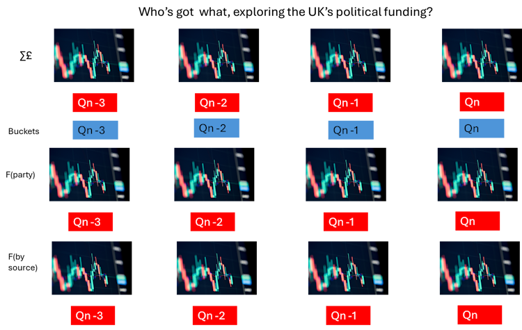
I think there are three dimensions we want to measure, and my experience is that this may be best done by quarter. As it the moment, I am restricting myself to chart formats supported by excel. I am also restricting myself to the three big parties. These restrictions are because of the difficulty in handling the large and small scales required. The charts are,
- The amount of money by top three parties, by quarter
- Neil’s buckets by quarter, as the year doesn’t scale within the infographic
- a size of donation frequency distribution by party
- funding by source, both volume and as a proportion of total; it might be good if we could build dynamic charts to turn public funding on/off.
The screen might look like this, or the front page could have buttons to second pages to deal with Money, Neil’s buckets, frequency within Party and by source.
At the moment, I plan to make the charts, and use the code to present them. NB (I didn’t).
The best I did was the last image on https://davelevy.info/wiki/political-donations-2023/
WordPress Charting
I found these pages
- https://crocoblock.com/blog/best-wordpress-chart-plugins/ an antholoogy review
- And two plugins https://en-gb.wordpress.org/plugins/wpdatatables/ & https://en-gb.wordpress.org/plugins/visualizer/
The query I used to find the tools.
My data sources
Mainly the EC,
- Their search portal, with filters set
- Their candidate spending page for 2019, does this do all, or only those that spend more than an amount
I am trying to create a political donations site.
I found the code for such a web page; I have reverse engineered the data model and database, and have made a landing page for my implementations of this tool; I have inserted my data file into Neil’s code and it can be viewed here for Q4 23.
I also created an all 2023 data file, but the javascript and the infographic is broken. The contents of the infographic are not scaled sufficiently; I wonder if it’s the two huge donations during the year. NB the scale at the side is also not context sensitive. I have tried to fix it using HTML/CSS but very little joy.
What it should look like is the last image on https://davelevy.info/wiki/political-donations-2023/
It needs someone with better javascript than me to fix.
I had another look at this page as I became interested in the amount of money spent by private sector companies. I have changed the comments about donations.whistle as the site seems to have gone away and improved the x-referencing to my implementation of the Neil Hawkins model. I note that I should have done a H1 24 model using it, to see who paid for the 2024 election.