Linkedin have been changing their look and feel over the last couple of weeks, possibly since the Microsoft purchase. I don’t find all these things good, as ever, here are my notes.
Groups
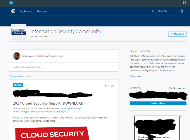
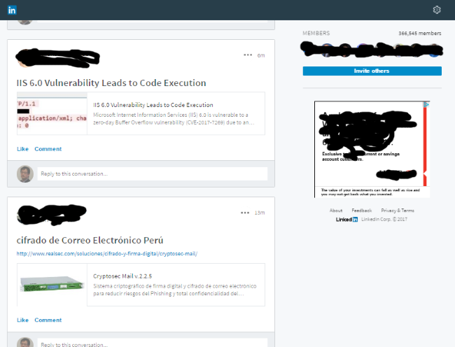
The page used to view groups is now very deep and thus not so easy to browse quickly, it only has one or two posts per page which isn’t enough for very busy groups, it looks like this, at the top of the page,
and this in the middle,
Feedly now looks like this, and used to offer the feed with one entry/line and have about 35 entries/page
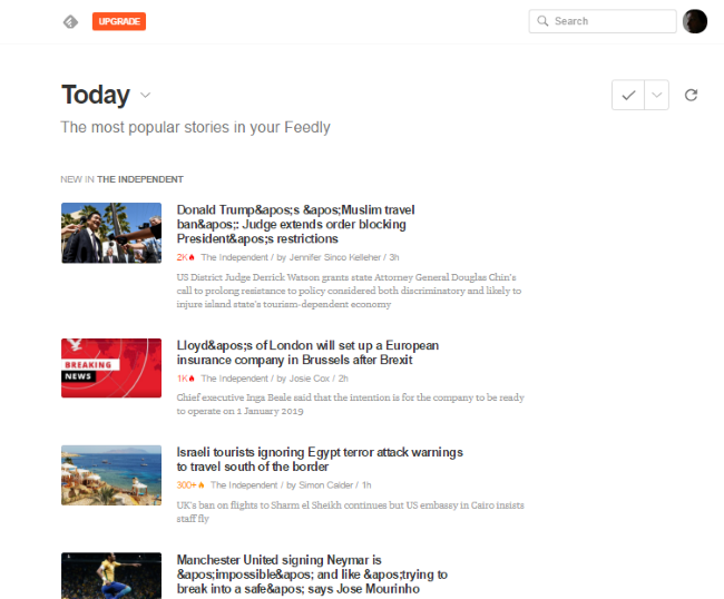
but even moving the picture to the absolute margin would save space.
Here is an example, of a very space greedy line/item display.
Maybe I should consider Stylish but that would be for Mozilla only.
RSS
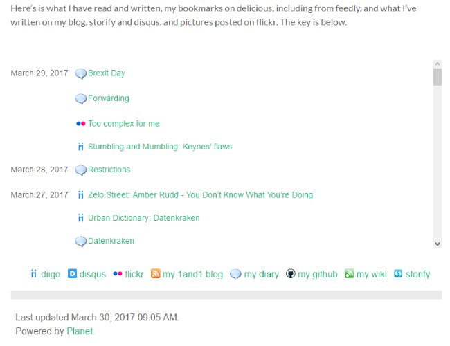
The picture above is from a planet aggregator that I run on my web site, it collects rss feeds from various sites I use and creates a spore. I’d love to be able to consume my articles and posts from linkedin into this new feed but this probably needs developer time.