I had a look at the financial reports and plotted Labour’s membership over the last 10 years and then added another 20. Here are my notes …
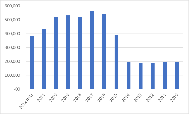
Here’s the table
| Year | 2022 (H1) | 2021 | 2020 | 2019 | 2018 | 2017 |
| Membership | 382,213 | 432,213 | 523,332 | 532,046 | 518,659 | 564,443 |
| Year | 2016 | 2015 | 2014 | 2013 | 2012 | 2011 |
| Membership | 543,645 | 388,262 | 193,754 | 189,531 | 187,537 | 193,300 |
and the chart,
Here’s a paper that looks at the previous 30 years, [ www | mirror | cite ] , Pemberton, Hugh & Wickham-Jones, Mark. (2013). Labour’s lost grassroots: The rise and fall of party membership. British Politics. 8. 10.1057/bp.2012.27.
What’s it look like with the old data added?

Here’s my 2nd data file with the leader facts and chart, and my data file if you want to play with it.
I made this chart to show the membership by Leader.
